2 - Foundations in technical analysis
This posts covers the bare minimum basics of trading and introduces you to trendlines which forms the basis of technical analysis. We then go over technical indicators such as moving averages.
Trendlines
Trendlines are the most basic form of technical analysis and help traders identify areas of interest when it comes to support and resistance levels. Additionally, they serve as a useful means of spotting reversals in the market.
Put in short, these lines help traders understand the direction of price action.
How to draw a trendline: In general if you can locate major tops or bottoms in price action, and connect the points, you generally do have a valid trendline. Although, the more tops or bottoms it touches, the stronger the trendline.
There are three types of trends:
- Uptrend - higher lows
- Downtrend - Lower highs
- Sideways Trend - Ranging, inconclusive.
Uptrend indicates that there probably is greater demand for the coin whereas a downward trendline suggests that there is excess supply of a coin, and hence decreasing price levels. For example, a downtrend on a 1day chart suggests that a higher price is unlikely given the longterm downtrend.
Trendlines essentially form support and resistance levels, which are crucial to understand as a trader.
Quick Primer on Support and Resistance Levels
The strength of a line depends on the number of times they are tested.
Support - The price level below which a coin has had difficulty falling beneath. Resistance - The price level which a coin has had difficulty breaching.
Essentially Support indicates a price point below which it is not expected to breach in general. However, when the price goes toward the support line, it goes through a test, and if the price bounces back up from the support it is a confirmation of the support level, else it breaks through and the support level is no longer valid. The support now becomes resistance.
The same way, when the price passes through a resistance, it can potentially become support. Note that the more often a resistance or support is tested, the stronger the area of resistance or support is.
Channels
So far we’ve learnt about trendlines and support and resistance levels. We will now move on to ‘channels’ which are essentially parallel lines, the tops and bottoms of which represent potential areas of resistance and support.
There are three types of channels: Upward, downward and sideways.
A sample strategy that a trader might use is to buy when the price hits the lower trendline of the channel and sell when the price hits the upper trendline of the channel. Effectively, the bottom of the channel is considered a buyzone while the top of the channel is considered the sellzone.
So now that you’ve learn’t quite a bit, how do you start using these tools to make trading decisions?
- Bounce / Break - There might be an instance wherein the price of a certain asset is close to the support level. This might represent a buying opportunity. However, we do not want to buy and watch the price break support and go further down. We will instead wait for the price to bounce off the support line, which is a form of confirmation that the price has bounced off it, and then place a buy order.
What should you do when support and resistance levels break?
Ideally you would set a stoploss, n order to minimize losses. Lets say you bought ZRX at 15,000 satoshis each. Your technical analysis says that this is the support level. You set a stop loss which is a % below your buying price. Lets say that I want to set my stoploss to 5%, that is sell my ZRX if the price goes to 95% of 15,000 satoshi, which is 14250 satoshis. When I set this stoploss, my ZRX will be sold when the price goes down to 14250 satoshis.
Effectively, I’m risking 750 satoshis per ZRX that I bought.
Moving Averages
Moving averages are a simple means of smoothing out price action over time. Looking at the slope of the moving averages plotted, you can better gauge the direction the price is headed in.
The rule of the thumb is: The smoother the MA, the slower it reacts to price movement. The choppier the MA, the quicker it reacts to price movement.
There are two types of moving averages: Simple and Exponential
Simple moving average
Put in short, a simple moving average is the mean price of an asset over the past ‘x’ days. For example, a single data point of the 7 day moving average of the BTCUSD trading pair would be the average price over the last 7 days. If the graph is pointing up, it means the pair is trending up. If the graph is pointing downward, it means that the price is trending downward, and if the graph is moving sideways, it means that the price is ranging.
Note that simple moving averages are susceptible to spikes and they can sometimes trigger false signals.
To plot moving averages on tradingview, go to the interactive chart, and click on ‘indicators’, then type ‘moving’ and you should see the moving averages option.
Heres an example, we’ve plotted three moving averages(7 day - purple, 14 day - turquoise and 21 day - red) on the 2 hour chart of bitcoin.
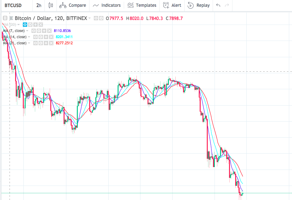
https://i.gyazo.com/2c4979fb5ae28e1ca70c7e1335227b7e.png
Exponential Moving Average
The exponential moving average, or EMA’s in short are similar to the simple moving average, except the fact that the most recent price points are given a higher weightage. It is important to note that this potentially removes the spikes caused by SMA’s. Additionally, EMA’s put more emphasis on what traders are doing most recently.
https://www.tradingview.com/x/G9jKFMyz/
It is important to note that EMA’s are highly reactive, which means they change a lot which spikes in price, which in turn may give our wrong signals about trends.
On the same chart as above, we’ve plotted three EMA’s (7 day, 14 day, 21 day)
https://www.tradingview.com/x/0pd6wqqe/
How does one use moving averages to find a trend:
There are several strategies wherein moving averages play a crucial role. Here are a few:
- Plot a single moving average and look at where the price action is. If it is above the MA, it suggests that it is a general uptrend. If the price action is below the MA, it suggests that it is a general downtrend. However, this strategy is way too simple and there are a lot of limitations and prone risks.
The solution to this is to plot multiple moving averages to give you a better idea of the general trend. An example would be plotting the 9 day SMA and the 18 day SMA.
If the faster MA is above the slower MA, it indicates that the price trend is changing and going upward. This is a buy signal, also called a ‘golden cross’
The sell signal, also called a ‘dead cross’ is when the faster MA goes below the slower MA.
Apart from this, there are several other strategies such as plotting the same interval SMA and EMA and watching for crossovers, using MA’s as support and resistance as a tool in your technical analysis etc.
More than often you will see seasoned traders using the 50 day, 100 day or 200 day moving averages to get a grip over long term price trend.
Relative Strength Index (RSI)
https://www.tradingview.com/x/aN109sJV/
The Relative Strength Index is an indicator that is scaled from 0 to 100. It follows market momentum. The formula for RSI is as follows:
RSI = 100 - (100 / 1+ RS) where RS = Average gain / Average Loss
It is not important to understand the formula to the root but it gives you a general idea of what this indicators tries to convey.
The typical conditions for RSI are:
30+ : Oversold 70+ : Overbought
The base rule is that oversold suggests a buy signal whereas overbought indicates a sell signal. However, in extended bear markets(prices keep going down) or extended bull markets(prices keep going up), RSI will not keep swerving all over the 0-100 scale. Instead, it either sticks towards the oversold area for a long time, or hovers about the overbought area for a long time.
Additionally, you can use RSI to determine the trend of price action. If, at any point the value of RSI is less than 50, it implies a downtrend, and can most likely be confirmed correlating with price action. If the RSI value is greater than 50, it usually indicates an uptrend.
Divergence
Another important use case for RSI is to spot divergence. This is when the price is moving sideways or downwards, while the RSI value is going upwards. This is usually followed by price going up.
We’ve got an example chart of ELF where we confirm a buy signal at at 9512 satoshis and a sell signal at about 15,000 satoshis. Note that RSI alone cannot be used to make buy and sell decisions. Most traders use the RSI along with other indicators such as bollinger bands, moving averages, MACD etc.
In the example, we’ve noticed a MA crossover(moving average crossover, shorter MA goes above longer MA), and we’ve also got an oversold RSI value. Although elementary, this gives you a general idea wherein we are able to combine two indicators and decide the course of a trade.

